highlights

awards and publications

what we did
Market and trends
Benchmarks
Customers and stakeholders
Brand diagnosis
Brand positioning
Brand purpose
Brand platform
Strategic recommendations
Tagline
Brand voice
Brand manifesto
Visual identity
Brandbook
Web design
Packaging design
Brand communication
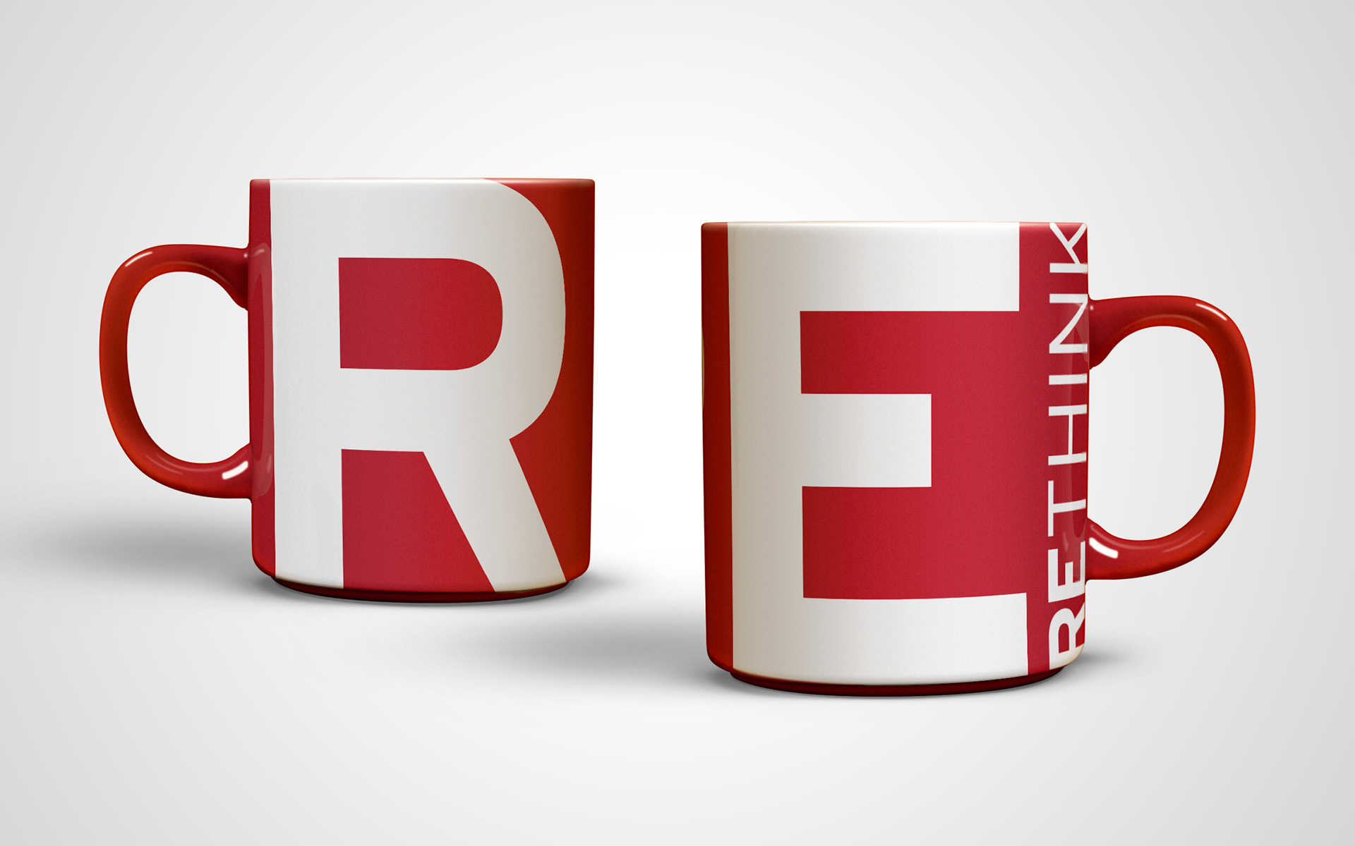
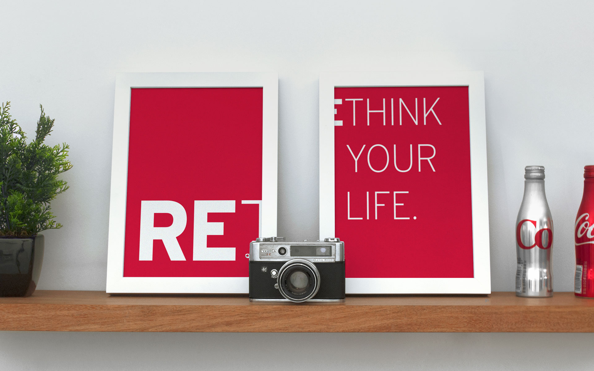
RE
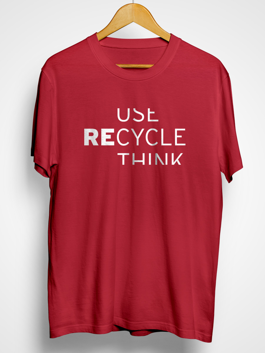
rethink
your life
MORE AND MORE PEOPLE ARE ADOPTING ENVIRONMENTALLY FRIENDLY HABITS and are more aware about the brands they consume. Investors from Southern Brazil found the opportunity to leave a positive legacy with their entrepreneurial spirit and to help make the world a better place. The main focus of the company would be to create efficient solutions to save natural resources and money for B2B’s and B2C’s market, both in Brazil and abroad. Thus, the main challenge was to create an intelligent, bold, and, above all, inspiring brand to represent sustainability in a new way. It needed to be out of the box.
inspiring change
Several researches led to a broader understanding of the path of sustainability and the profile of those who consumed sustainable products resulting in the identification of opportunities. Inspired by the brand idea “Smart people inspiring a smarter planet” which invites people to rethink their habits and behaviours, a new name with a unique approach was created. It’s totally unexpected and flexible: RE. The prefix RE, meaning Do Again, is a peculiar and intriguing name that brings several concepts to mind such as remake, reuse, reduce, renew and recycling. It was strategically thought to consider the international operations of the company and can be easily used in English, Portuguese and Spanish; without semantic loss. The identity used bold colors, typographies and phrases that lead to reflection, setting it apart from its competitors. RE suggests a new, more intelligent and humane lifestyle, highlighted by its tagline: Rethink.
results for a better future
All that was developed by Saad started from the fundamentals of sustainability (recycle, reduce and reuse) and sought to reduce production processes as much as possible. The lamp packaging are made of a durable and recyclable material, and one of its main advantages is its multifunctionality proposal. It can even be reused as a plant pot, as it comes with a seed paper tag – a special kind of paper that can be planted inside the packaging itself. The data sheets (technical boards used by suppliers and resellers) were also developed with special care. They were grouped according to the need of those who will receive them making it possible, not only to customize the presentations, but also to reduce a lot of paper. The project generated a revenue increase of 1003% in two years and was recognised by the main packaging curatorships in the world, such as The Dieline in its article “These 20 Designs are More than Just Cool Packaging — They’re an Experience” and Packaging of the World. Furthermore, the project was awarded at the Premios CLAP and also at the iF Design Award, one of the most important design prizes in the world.


The Dieline, "These 20 Designs are More than Just Cool Packaging — They're an Experience"


Juliano Alferes, product manager of RE