highlights

awards and publications

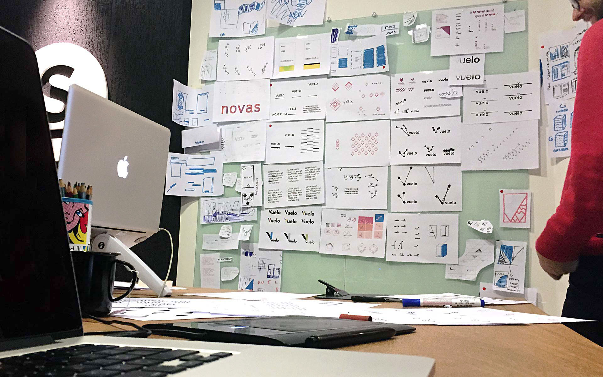
what we did
Market and trends
Benchmarks
Customers and stakeholders
Brand diagnosis
Brand positioning
Brand purpose
Brand platform
Brand architecture
Business model innovation
Strategic recommendations
Tagline
Brand voice
Brand manifesto
Key messages
Visual identity
Brandbook
Web design
Packaging design
Brand communication
Product & service concept design
Vuelo
new
possibilities
A PERSONAL STORY — THE DESIRE TO RELIEVE THE PAIN OF SOMEONE IN THE FOUNDER’S FAMILY — inspired Membracel, a medical solutions company, to transform the lives of many. Preparing itself for a new phase, the company, along with the institution Centro Brasil Design, contacted Saad to conduct the launch of its new products and the national and international expansion of its business. Through detailed analysis, new challenges were found: the name Membracel, which referred to one of their products, a cellulose membrane, would not be ideal to accommodate new releases. A creative, coherent, and structured brand repositioning was needed to bring the credibility and the transformative character presented in each and every one of their products.
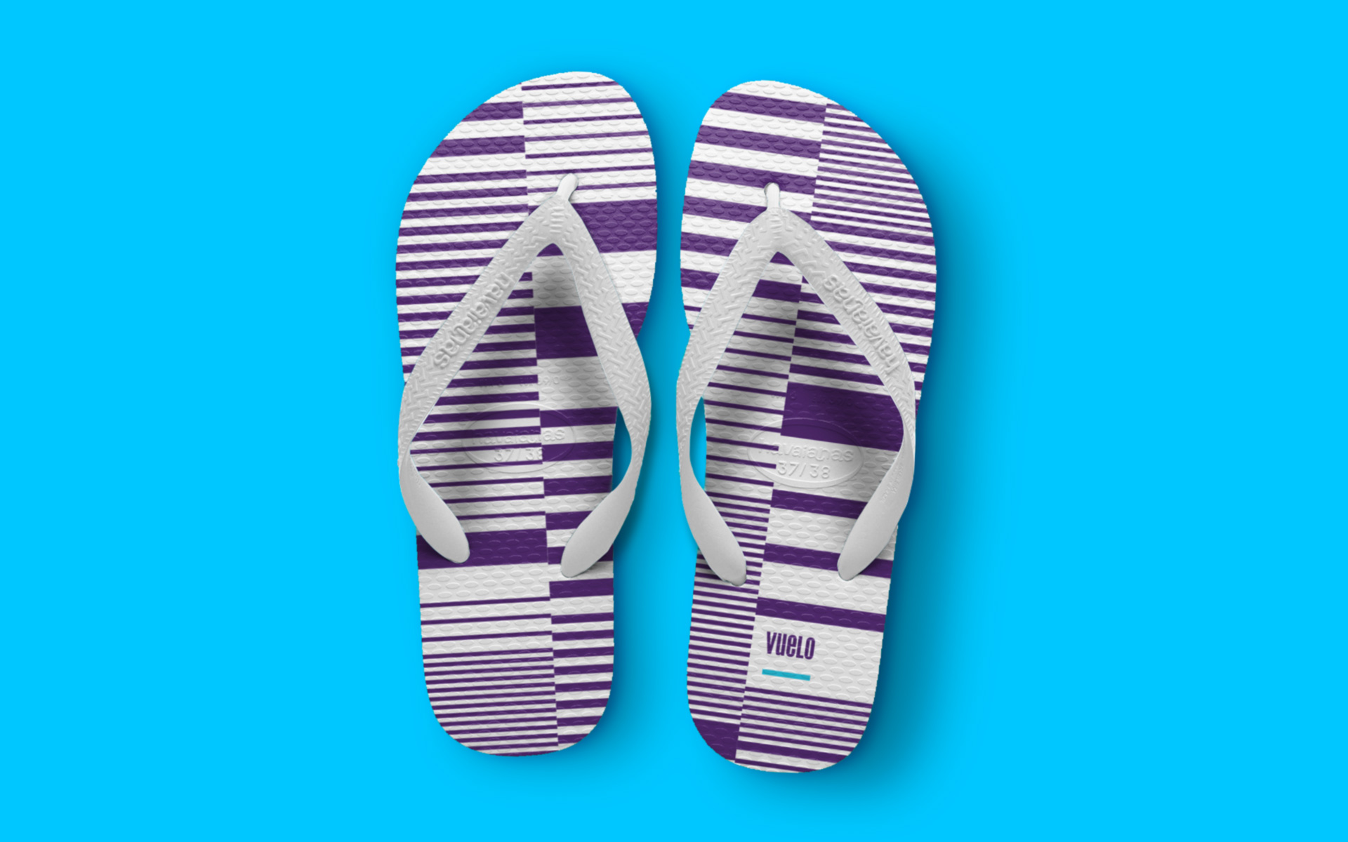
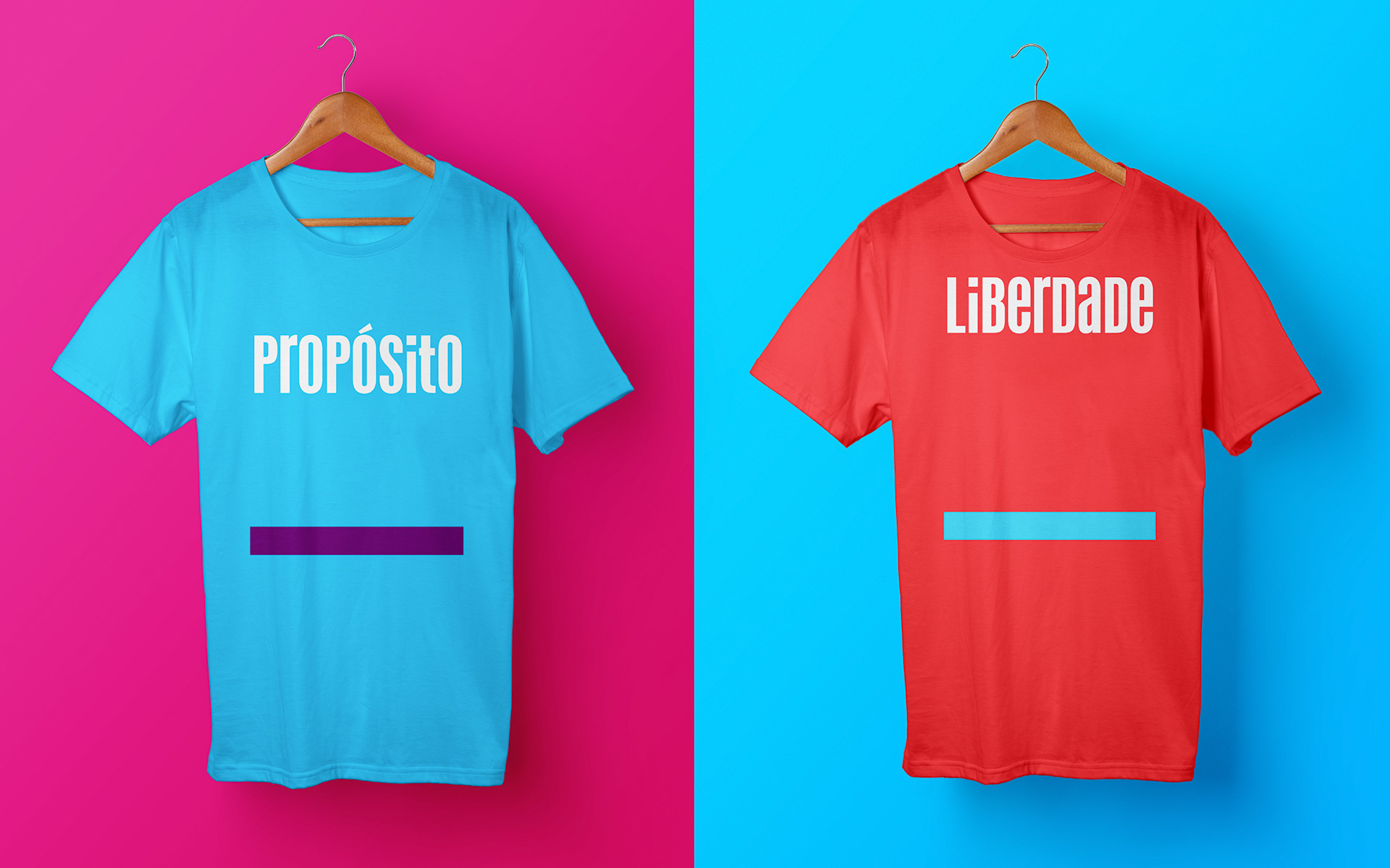
a new way of seeing life
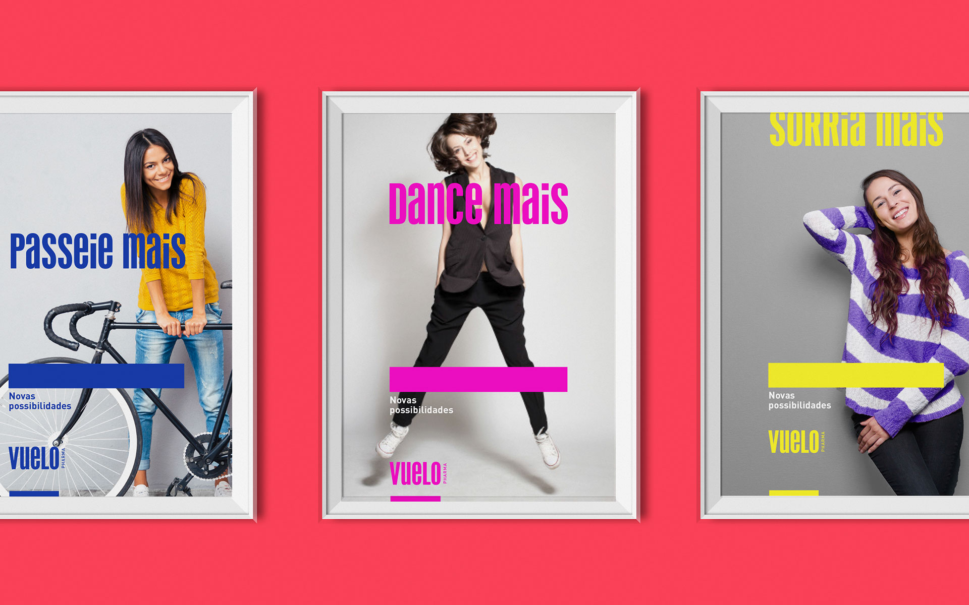
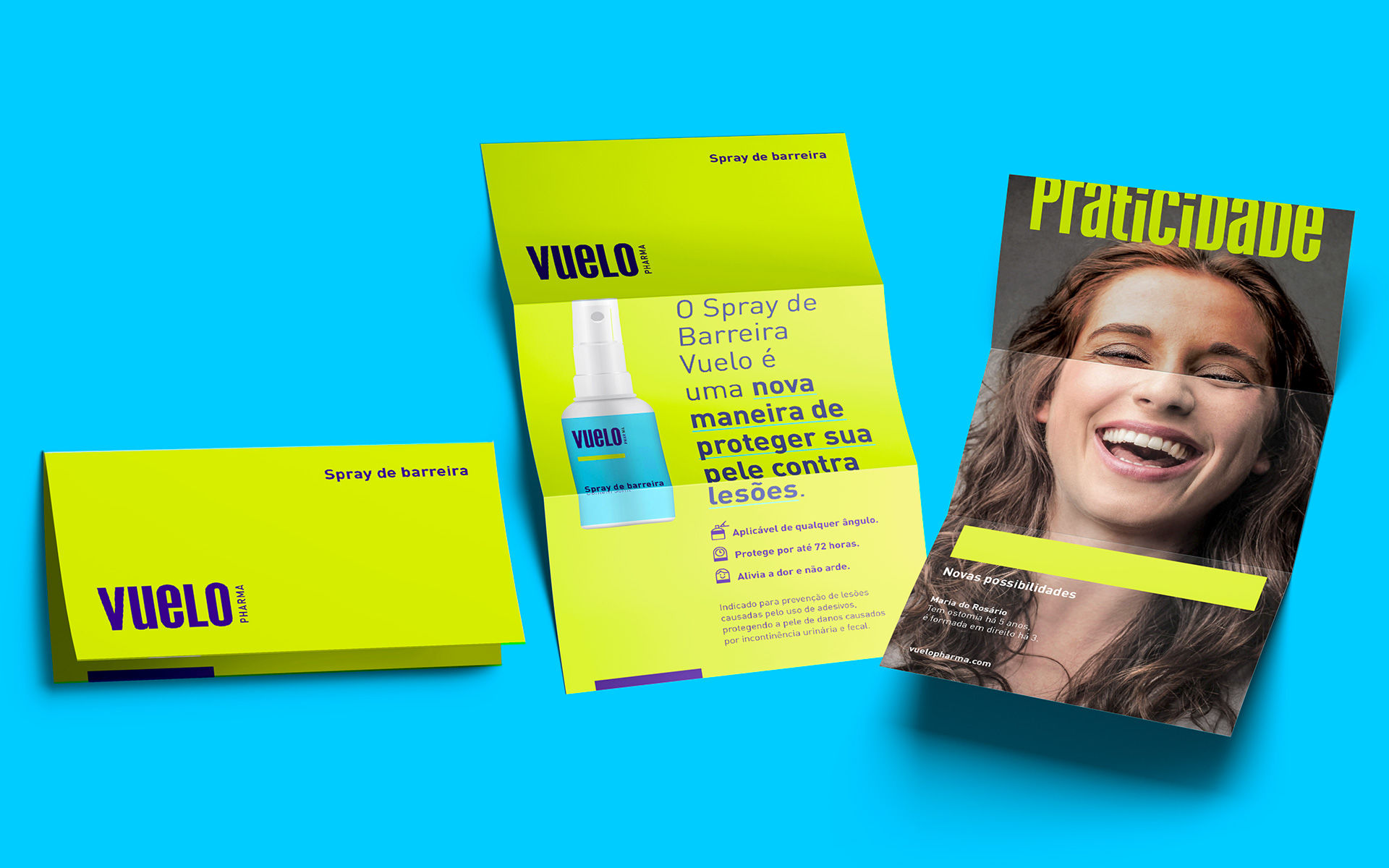
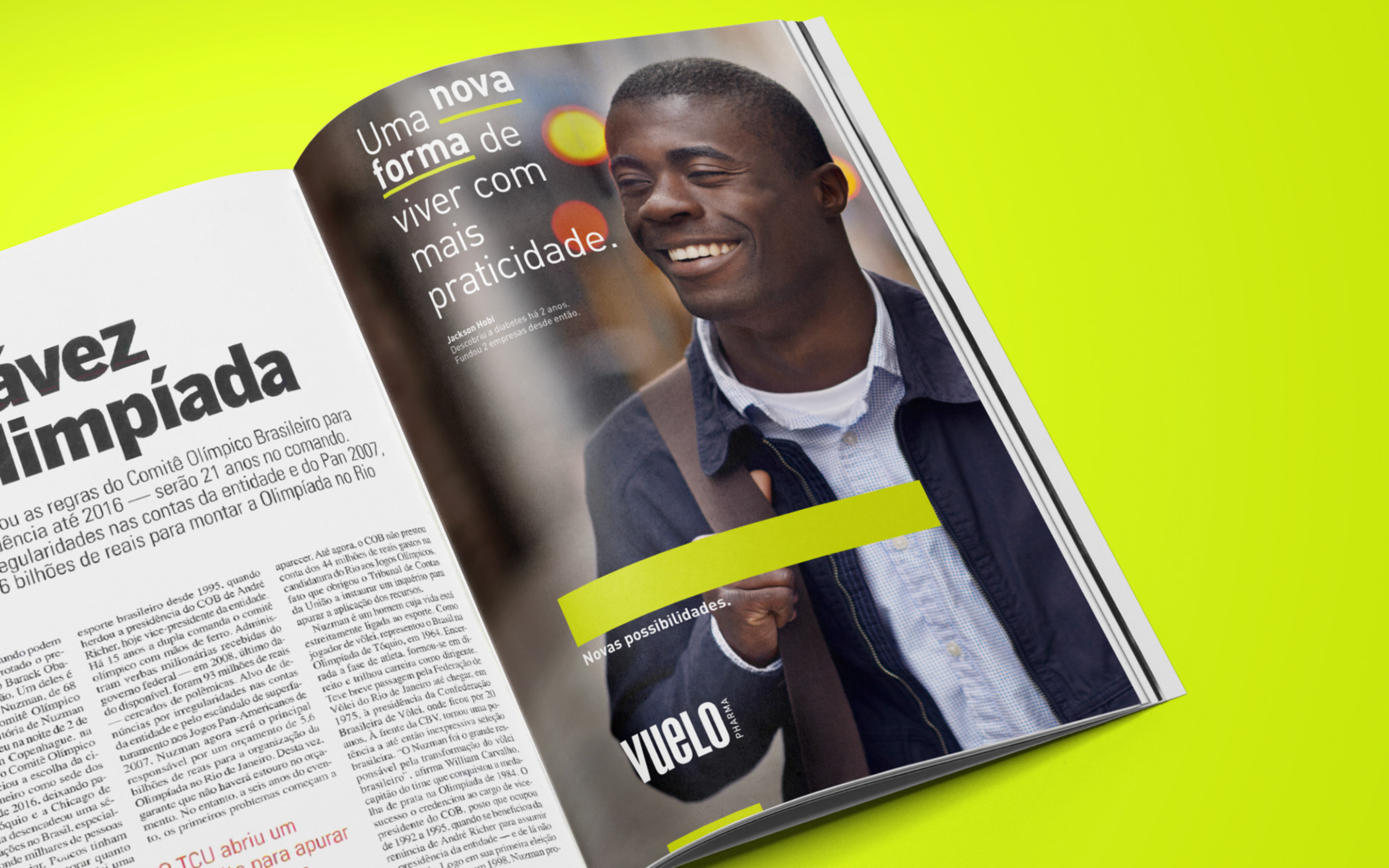
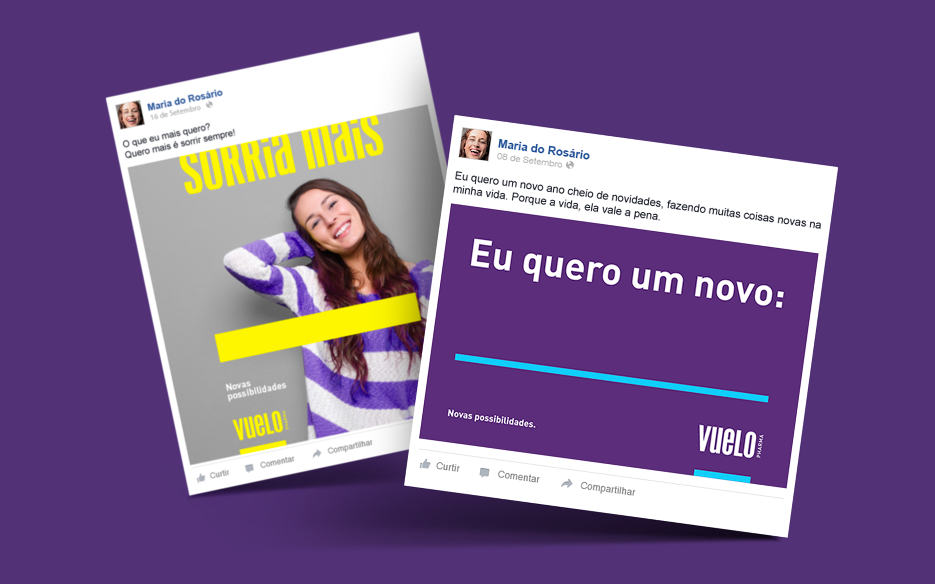
Through various surveys and interviews with patients and healthcare professionals, it became clear that one of the most interesting opportunities was being able to understand and help a human-being hollistically: by looking through new perspectives and considering all areas impacted by diseases in patients – like the biological, psychological and social –, the brand would be greatly differentiating itself from its competitors. Through the intersection of information, an inspiring name was created: Vuelo, a noun that in Spanish means “flight”. Vuelo is associated with desirable concepts for the target audience such as transience, progress, change, speed, action and freedom. The New possibilities tagline invites people to look at life from new perspectives and can be adapted in many forms, depending on the message it is looking to communicate, such as New ways, New views, New opportunities, etc. The graphical approach is synthetic: the baseline serves as a point of reference for the name and as the logotype and words move away from the baseline, we see a “flight” movement that brings dynamism to the identity. The baseline also represents protection and support, besides functioning as a highlight, indicating something important, like its logo, words, people and products.
new reasons to smile
The new brand positioning ensures a great emphasis on every touchpoint that impacts the consumer, fueling curiosity, enhancing communication, and the impression that the brand leaves. Unlike the competitors, Vuelo’s human approach makes the strategic positioning clear, focusing on people and not on their diseases. The project, which was awarded at the Lisbon Health Festival, Premios CLAP, Bienal Iberoamericana de Diseño, Bienal Brasileira de Design Gráfico and Brasil Design Awards, was also acknowledged by its audience: “It’s different from the lifeless white packages we’re used to seeing. It’s innovative. This packaging makes you forget that you actually have a problem”, says Viviane Oliveira, a patient and Vuelo’s client with an ostomy. In addition, in two years the project brought Vuelo an increase of 53,5% in revenue, optimizing the international expansion of the company as it began its operations in markets such as the United States, Germany, Mexico, and countries of South America.


Viviane Oliveira, Vuelo's client


André Estrela, Vuelo's client