highlights

awards and publications

what we did
Market and trends
Benchmarks
Customers and stakeholders
Brand diagnosis
Brand positioning
Brand purpose
Brand platform
Brand architecture
Naming
Tagline
Brand voice
Visual identity
Web design
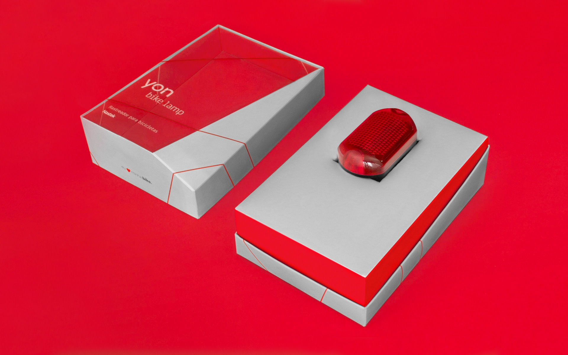
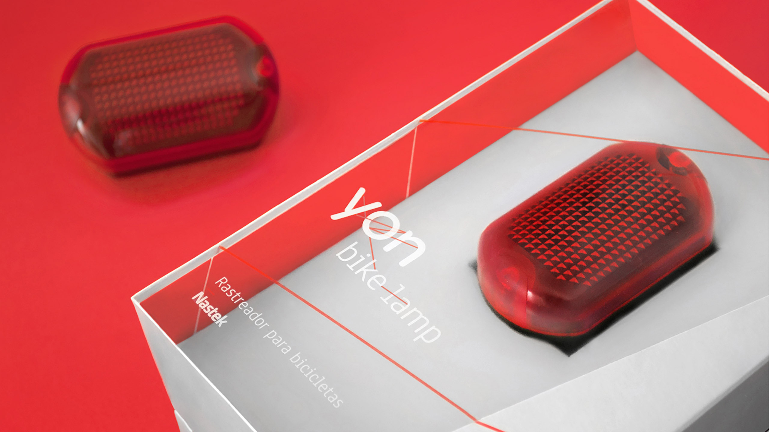
Packaging design
Brand communication
Brand activation
Yon
distant, but
within sight
AFTER A SUCCESSFUL PATH IN THE B2B MARKET, Nastek — the leader in Brazil in high performance data communication systems — would start its journey on sales directly to the final consumer by launching a line of trackers unlike any other. The need to create a brand that truly dialogues to its audience is much greater in the B2C market when the relationship between company and consumer is closer and more personal. The importance of such a dialogue is even greater when the product carries an emotional appeal. Trackers, even though they’re electronic devices (and tend to have an inherent coldness), relate directly to care, safety and quality of life. Thus, Nastek set out to launch a line of trackers that would differ from everything already on the market: with excellent signal levels, long life batteries, extremely reduced sizes and an appealing and functional design. Saad was called to create a brand that stood out in its market so that Nastek consumers would have everything and everyone they love within sight, even if at a distance.
a brand connected to its audience
The project that originated the brand was called on to fulfill a gap left by the competitors in the same niche: none of them had a personal, close, or friendly positioning for their products. Several immersion researches gave life to a name that fit the new strategy perfectly: Yon — short, direct and easy to pronounce. Yon means “distant but within sight” and relates functionally and emotionally to the trackers. The entire identity was developed under the concept “all connected“, suggesting movement, speed and connectivity, the main attributes of the trackers. Several lines of different colors cross into the logotype and the visual identity connecting letters, words, and images, allowing a variety of applications and reinforcing its presence as a multifaceted brand.
proudly made in brazil
The brand overcame expectations even before its commercial launch. The first product of the line, Yon Bike Lamp — a small tracker in the shape of a bike light — gained a lot of attention from the specialized press worldwide during the pre-order period. Over 400 relevant international websites, such as Yahoo! Finance, BusinessWire, Fox News, CBS, and Business Report recognized Yon Bike Lamp as an innovative product and highlighted its proud Brazilian origin. The branding project for Yon gained recognition too, having received awards from Bienal Brasileira de Design and Bienal Brasileira de Design Gráfico, and also being featured on publications such as Color Code and websites like Design and Design, Packaging of the World, Identity Designed, Creative Inspiration and Daily Inspiration. The project also influenced the pricing strategy, allowing Nastek to increase its sales price considerably due to the added value acquired because of the project, in addition to their soon-to-open first international headquarters in Miami, USA.


José Wanderley Scucuglia, CEO of Nastek


José Wanderley Scucuglia, CEO of Nastek